Sunday, January 30, 2011

Me and Mohammad

Arief Kamaludin Rahmat
Mohammad Revaldi

Paul Kadarisman
Mohammad Revaldi


Frances Stern sent me a link to TAP, the Trans Asia Photography Review.  While a quick viewing seems to reveal a more academic enterprise, I found one piece particularly interesting.  


"Me and Mohammad" looks at three views of life within Indonesian Muslim society.  They were taken in response to a question, what does it mean to live in the largest Muslim nation?


First, some background:  Some years ago I worked on a PBS series for Maryland Public Television called Mini-Dragons, an international co-production of MPT, NHK Japanese Television and Film Australia.  As Executive Editor I was responsible for helping shape the series and worked closely with the NHK team to guide their approach to storytelling.  One of their programs focused on Indonesia.  Back then I saw that country as exotic and I'd have to say somewhat mysterious.  Perhaps my best sense of Indonesia was gleaned from the wonderful "Year of Living Dangerously."  


Anyway, today I was struck by some of the images from this photo essay.  And even more so by how hard it was to decode what I was seeing.  Of course, these days we all see Muslims through a different lens (meaning events have propelled a more heightened awareness and sensitivity.  Where some of us see victims, others see a potential threat, still others see people the same as you and me, just trying to live out their lives.  Of course, Muslims are more varied than any of that.  But it's a world, if you will, that remains unfamiliar at its core.  Unfamiliar to me, anyway).  Perhaps that's why I'd like to talk about the few photos I've included here.


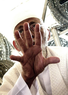
The photo top left shows, I believe, an ex-leader of a radical Islamic group.  I especially like the way his hand obscures his face, an emphatic gesture in this close up view that reveals a sense of power as it also prevents any chance for intimacy.  So we witness a person at once revealed and hidden.  We see power and mystery.  Yet on closer look, his expression is without anger, seemingly making him centered more in the world of ideas rather than the world of raw emotion.    Interesting juxtapositions.  


The birthday cake is so "normal" it becomes surprising.  Here, we're talking "normal" in terms of my own cultural expectations.  But, thinking about it, why not?  Everyone has a birthday and how nice to see it celebrated in a culturally familiar way.  Unlike the first photo, it's easy to relate to this image.  And, as the article explains, the focus of this photographer is upon people who are more economically privileged.  So it's more likely they would embrace some customs imported from the West.  


Then, bottom right, taken by the same photographer, we see a prayer before launching a Ramadan TV show.  But here we encounter the worshippers in a studio of a pop singer, and close examination shows wall posters of Jimi Hendrix, Kiss, the Beatles, and the Rolling Stones among others.  It's a little like the photo of the birthday cake.  Different, yet familiar.  And you could say a reminder of how much our culture has influenced others so far from our shores.  And whether that influence is embraced by them or rejected, it still transforms.  Maybe that's what speaks to me about all of these images:  culture, and understanding, is ever evolving.  


The fourth image is part of a photo series of the photographer's friends, all named Mohammad.  To me they seem to be part of his own personal in-joke.  Me and Mohammad means me and my pal Mohammad?  Okay.  But, again, the images are so westernized.  What we see, really, is an image of two photographers, posing for a joint self-portrait.  I can't go very far with this one, other than it has within it that youthful studied coolness coupled with a kind of bored informality.  Some form of a slouch towards a visual version of "what ever."


So what's the overall vision?  We all see the world through similar eyes.  And we don't.  There are meanings within that are lost to us because we're from different cultures.  And yet, there is enough "there" there that I can use it to shed a little bit of light into another world.  And find a moment to reflect and imagine all of what we know of the world that we all share.  

Thursday, January 27, 2011

Photojournalism: Something Old, Something New

Both photos by Todd Heisler


It all started with a blog in the NYT about the death of photojournalism.  Quoting Neil Burgess, former UK Bureau Chief of Magnum:  "Magazines and newspapers are no longer putting any money into photojournalism. They will commission a portrait or two. They might send a photographer off with a writer to illustrate the writer’s story, but they no longer fund photojournalism. They no longer fund photo-reportage. They only fund photo illustration."  


His comments remind me of one of the great examples of modern photojournalism that originated in the NYT photography blog, Lens.   One in Eight Million was groundbreaking, based on the simple concept that NY is a city of interesting characters.  Each piece (running about three minutes) plucked a New Yorker out of their every day life and told their story with a sound montage of their voice and evocative B&W photography by a NYT photographer.  The people came from all walks of life and the series described as an "ode to the city," won an Emmy for "new approaches to documentary."  I found "One in Eight Million" fascinating, posted several blog entries about it, "One in Eight Million" "Letter to Michelle McNally" , told friends and colleagues.   It takes empathy and considerable skill to create a compelling story arc in three minutes.  You can still see the pieces by following the link above.  


But that was that.  For whatever reason, the NYT decided to end it.  I'm sure that Emmy was a bittersweet moment for the series producers and photographers.

I see other examples, too.  Here's a link to NYT Photographer Chang Lee's innovative "Second Chance" series that also died on the vine.  It launched in the NYT website in June, 2009 and I believe ended later that year.  I wrote several blog posts "A New Way of Seeing" and "Capturing the Stillness" about his work, too.   Chang was incorporating video and photography to frame a person's story in key "moments."  He created those moments to allow the viewer time to pause and reflect, and gain a deeper insight into the story he was telling.  They say a picture is worth a thousand words.  Chang Lee helped show the truth behind the cliche.

So, for about a year or two, the NYT was one of the most innovative sites on the web for using video and photography to tell stories.  And yes, I still see the names of their great photographers in picture credits, but now it's news photography, not explorations of ideas, issues, people, environments, etc. that seemed to offer such promise in the early days of Lens.

Well, I can't end this post with such a downer, so I want to point you towards something new.  New to me, anyway.  And that's a new site devoted to photojournalism.  It's called Fraction Magazine and it features a wide variety of work, much of it devoted to telling stories with pictures.  And reviews.  And sometimes wonderful surprises, like the work below, created in the 40s by Gita Lenz.  Her work, recently rediscovered and published, was featured in the Edward Steichen-curated exhibit "Abstraction in Photography" at the Museum of Modern Art and calls to mind some of the great work of that era.

And these days, Fraction is a great place for those interested in new ways of using images to capture character and exploring the art and ambiance of storytelling.  And, hopefully, it will be around for a long time as a source of inspiration for all of those involved in the visual arts.


Tuesday, January 25, 2011

Underground Marvel


I guess we've just naturally assumed for years that anything built underground doesn't merit the artistic touch.  Certainly the DC subway is an engineering marvel, but bland, especially after all these years.  Unbroken visual uniformity and a utilitarian aesthetic.  I know the NYC subway system had a certain flair when it was built, some stations had strong decorative touches, but then it all got very run down.  It's gone through a renaissance of sorts, especially in terms of the performing arts.  As you walk through the now much cleaner passageways, people performing music are everywhere.  DC is struggling to just keep up.  Lots of delays and obstructions due to long overdue repairs.  

The Swedish subway system is a marvel.  An innovative marvel.  No, I've never been to Sweden, but the images of that transportation system fire the imagination.  You can check out photos of this underground wonder at this site.  
All of this an excellent example of how a greater vision can be realized by dreaming big.  And hopefully an inspiration to never settle for "good enough."

Sunday, January 23, 2011

Space and Timing

Working on a short video celebrating the contribution Planning Director Amanda Burden makes to the City of New York has me thinking about space in more ways than one. I've been editing and interweaving the comments of five people (architects, planners, innovators, etc) describing the impact she's made on the city. I organized their dialogue thematically, added pauses between their thoughts and selected music to bind everything together and create an emotional arc.  I've found that designing video this way makes it easier to absorb their thoughts.   So all of this had to be accomplished before adding images of a revitalized New York.  

And while they're all talking about Amanda Burden, creating a livable city, urban design, space and sustainability, I'm thinking about how to create a different kind of space within the boundaries of this short three to four minute video.  

First, some background:  
Editing what people say is quite a different experience than editing their words on paper. Most people tend to speak quickly; their thoughts tumble out a melange of phrases, repetitions, with stops, restarts, stutters and an often twisted sentence structure.  Reading allows you to stop and consider.  But video keeps on rollin' by, so if you're not careful with the words, music and images, it's easy to bombard, overwhelm or simply bore your audience.  So how one fills up the space in a three to four minute video is the difference between ho hum and wow.

And what makes it more complicated is this:  
When we speak face-to-face we can usually decode what someone is saying by paying attention to their tone of voice, emotional cues, hand gestures, facial expression and body language. But making a video, we usually try to avoid "talking heads," so all those comprehension cues get thrown out the window as we cover up their visual insights with images.   Which makes the ability to carefully edit and place spoken comments all the more important.

And you have to do it invisibly, making it seem and sound like the words weren't edited at all.  

Once you've mastered that skill, you need to orchestrate how the words are delivered for maximum impact. Any seasoned public speaker knows that timing is the riverbed through which the words flow. It's what comedians and actors live for:  Timing.  And that's also crucial when editing and structuring someone's words.

And no, I don't change their meaning.   I use editing to enhance what they're saying, making their remarks succinct and crystal clear.  And then I surgically add space between the phrases, sometimes even adding full stops, to create, with the music, an internal rhythm.   Giving greater weight and impact to the words that remain.  And giving the viewer the space to process what's being said.  

It's a little like a poem, 
where the visual space
on the page 
gives the words  
greater meaning.  

Ultimately, it's more like designing than editing, with each moment constructed as a brief embrace and then sending them on to the next.  

Wednesday, January 19, 2011

What He Could See


This piece is about social documentary photographer Milton Rogovin.  His recent passing occasioned articles in the NYT, Washington Post and NPR.   As a marxist, his politics propelled him to document the lives of the working poor.  Some in his home town of Buffalo, others in Latin America.  Much of his work is now housed in the Library of Congress, the Getty Museum and the Center for Creative Photography.

One could say he opened a window to the lives of people who are typically invisible.   His work has been compared to Jacob Riis (an early muckraker, famous for his photos of the horrors of tenement life) and Louis Hine (another social reformer whose photography helped change the child labor laws). But I think Rogovin is doing something else.  I feel his work is more celebratory.

 Of course his work often shows people in difficult straits. But there is a dignity and a humanity that shines forth.  I think that's what he saw and wanted to capture.  The NYT piece includes a short audio interview with him.  In it, he says he never posed his subjects or told them what to wear.  His only request was that they look at the camera.  He wanted to show the unvarnished truth.  He continued:  "To make pictures in this way is an act of respect, an exchange between the photographer and his subjects."  I think that respect for their humanity and his feeling of being peer with them is what makes his work so alive.

You can feel the interaction between the man and the people he photographed.  He cared about them and used his skill to honor them.  (He also gave copies to the people he photographed). And often they return the feeling.

For him, the camera is just a tool to document those interactions.  And in the process capture something vital that reveals the person on the other side of the lens.  His photographs enable us to see what he could see.  And without his singular vision and a determination to honor "The Forgotten Ones," we would never know they existed.

Monday, January 17, 2011

What You See What You Get

Is what you see inevitably what you get? Well not necessarily. Here's an example of what I mean:

Working on a video for the US Conference of Mayors about JFK and the Call to Public Service. Using still images from his presidency and moments from his speeches to capture that sense of who he was and how he inspired others. And opening the piece with just a few comments from mayors talking about how he inspired them and the nation.

Since this was to be an introduction to the video, I wanted to keep the comments short and succinct. So I chopped up their statements to pare down their thoughts and organized them to get the flow I wanted. So far, so good. But then the question: what images should I use? It would have to be something to visually play off what was being said.

Since this video is being created for the 50th anniversary of his presidency, I wanted something dreamy and nostalgic for starters. That, plus the right kind of music, would give more emotional weight to the opening and more power to the comments. When I saw this photo, I decided to shape the introduction around it. This photo is a great example of the difference between seeing and perceiving. What do you "see" when you look at this image and how do you perceive or take in what you are "seeing?" In considering the creative process, each question gets a different answer. Here's what I mean:

Objectively speaking, the photo above shows President Kennedy consulting with his brother Robert, who was then Attorney General. Their body language shows a personal and "private" moment and reflects the seriousness of what they are discussing. The president is obviously distracted by something or someone. Probably the photographer. He is looking away from his brother, and facing the camera. That's the first thing I "saw." But I perceived something else. If the photo was cropped to focus just on the President, it would give the image a totally different context. Still a serious moment, but more abstract. And now you can read much more into the photo. The President's gaze seem as if he was looking right at the viewer, as if sending a message. Which makes it very engaging.

And look at the background. You can see leaves, but they're white. Meaning it was a sunny day and the Kennedy brothers were in shadow, probably standing under a portico at the White House. Also, the photographer was some distance away, using a telephoto lens, which flattens the image. Now the background is out of focus, making the image a little less "real" and more abstract. If the photo was exposed for the sun striking the leaves, the President would be in darkness. But printing the photo so you can clearly see his face also gives it a grainy quality. Again helping make the image more abstract. And that abstraction takes you out of the "reality" of the moment and makes it easier for you to add in someone's thoughts or feelings. The bottom line? You get a dreamy, almost ghostly quality to the image. Perfect for a representation of nostalgic memory.

Monday, January 10, 2011

The First

I'm going to use this blog to write about the Vision Thing.  Meaning creativity, vision, innovation when and where I find it.  For creative people, burnout is a major hazard.  So one needs to find new sources of inspiration.  And, having worked in the film and video business for many years, I find inspiration in discovering work that is fresh, unusual and outside the expected.  It challenges me to think about what I'm doing with new eyes.
Some specifics:  I work as a video editor and writer.  Started editing in the middle 70s, so I've been doing it for quite some time.  I'm a content person, so if you're looking for cool editing techniques, you won't find them here.  In my world, content is king.  Tech exists to serve it.  And ways of exploring, presenting, parsing and displaying content are what I deal with on a day to day.  But my interests are well beyond the job at hand.  Because we all live and function in a larger world.  So we'll see how it goes, but I'm looking forward to the journey.