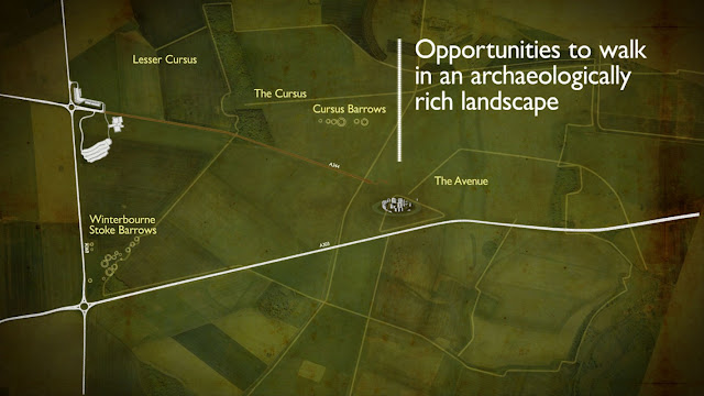
I'd like to point you to an elegant example, recommended by my colleague Bob Burnett. A video from the British design and architectural marketing firm Squint/Opera and their Stonehenge project. You'll find it a little later in this post.
Their design approach is simple and elegant. Without commentary or narration, they use fast-motion images and text to clearly portray the issues. And the video creates a visual vocabulary to show the present day approach to this national treasure as tatty, unseemly and poorly conceived. Stonehenge definitely needs an intervention.
So what will that be? The imagined solution uses a combination of images and computer animation to illustrate the future. Here's a better-designed ambience for Stonehenge, with a sense of "before" and "after" deftly realized. The music track walks you through the visual journey with crisp, easy steps. Its bell-like qualities heralding a new age for the ancient monument. Well-imagined and executed. If the Stonehedge video doesn't play, you can find it here.
I've looked at other videos on their site and have to admit that I dislike all of them. Where the Stonehedge video is an understated delight, the others are over-the-top, annoying and much too self-important. I guess the knack for visual poetry is doled out more in tablespoons than teacups.
 But to end on a more upbeat note, I did like the design ideas they had for The Doodle Bar. For this funky tavern, their hipster artiness makes its mark.


